The Challenge
Before 2010, TYPA within Taipei American School was having an in-house built website that was limited in its functionality. Over time, the site had become outdated and repetitive. The website was failed to showcase its strong academic program, outstanding student services and culture.
TYPA’s website was visited daily by parents that needed to quickly access important information about school events and updates. However, the website was difficult to navigate and cluttered with outdated information. Moreover, the website was feeble and slow when making simple updates.

The Solution
Our goal was to redesign the website using minimalist style and create a clear interface with user's demands in mind.
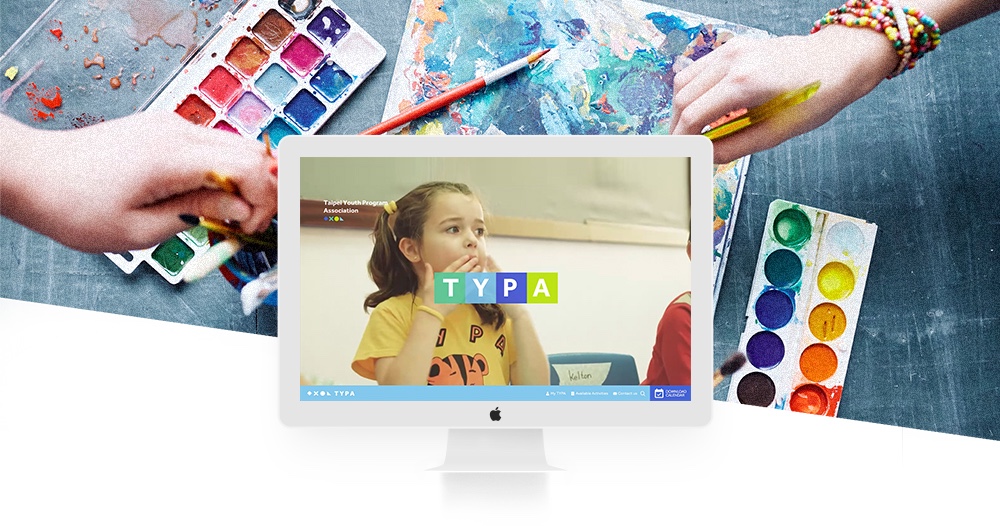
We revamp TYPA's brand image by adding video and picture of school life that vibrate the school's impression.
Key features
The brand new web design reflects TYPA's rejuvenating brand image and well-organized digital strategies.
- 1.
TYPA's website now attracts new audiences and clients, bringing out website's visibility.
- 2.
Reflects both socially compassionate image and the school's academic excellence
- 3.
Increased interaction of parents and school
Useful, accessible resources are well organized - 4.
Simplified website maintenance allows TYPA staff to update content without third party involved.
- 5.
Community service, programs, and schedules are now accessible
- 6.
The unique and exploratory school atmosphere is conveyed through featured lessons and events on web pages

Client
- TYPA
Date
- July 2017
Industry
- Corporate
Key Services
- Brand Strategy and Identity
- Web Design
- Responsive Web Design (RWD)
- User Experience (UX) Design
- User Interface (UI) Design
- Laravel (PHP web framework)
- Wordpress (CMS)